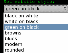
A couple years ago, I read an article in A list apart about a style switcher for a website. I thought this was a great idea — let the user choose their favorite style. So I set about implementing it. I have had it on this blog since the beginning. Personally, I find black text on a white screen hard on the eyes. I spend most of my editing in a terminal with green text on a black background. I know that is not for everyone though. That was my thinking on the different styles I have for this site.
Over the last couple years though, I have noticed that few people actually notice the option to change the style. I have noticed this mostly when people have complained that they didn’t like the style, and they did not even notice the switcher.
Just today, I was chatting with my friend Danny, who pointed to me an article by Joel Spolsky about how too many choices can be bad. In it he states that:
Every time you provide an option, you’re asking the user to make a decision. That means they will have to think about something and decide about it. It’s not necessarily a bad thing, but, in general, you should always try to minimize the number of decisions that people have to make.
I don’t agree with everything Joel says here. In general, I am in favor of lots of options. That is one of the reasons I like the KDE desktop (and why I haven’t switched from 3.5 to 4.x yet — I hear 4.2 has re-introduced many of the options absent in 4.0 and 4.1). But I am wondering whether I should get rid of the style switcher altogether. What do you think? Should I keep the switcher? If not, what is your favorite option?
