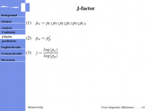
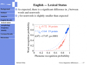
Yesterday I gave a talk in the Linguistics department colloquium series. I like to cover all my bases, so I had a handout and a slide presentation, which were both made from the same LaTeX code. In an earlier post, I briefly discussed using the prosper package for LaTeX to make presentations. A few months ago, I discovered the powerdot package, which is kind of the niece of prosper (cousin of ha-prosper). The syntax and framework is very similar to prosper, but it has a few advantages. Some of the advantage include better overlay and verbatim support, which is definitely nice. I think the biggest advantage though is the possibility to include a running table of contents on your slides. You can see this in the screenshots below.

In the first screenshot, you can also see some nicely typeset equations with LaTeX. This is an obviously nice feature of using LaTeX to do presentations. If you are already using LaTeX for other writing, you can do a lot of copying and pasting, which certainly is not possible with powerpoint (for equations at least). And, if you like dark backgrounds with light text, this works fine for your equations. Powerpoint seems to only be handle black on white equations.

Back to the running table of contents. This is probably not great for everyone, but at least one person who was at my talk said he liked it. And I agree. It lets you know where you are at in the talk the whole time, and is fairly unobtrusive. If for some reason you need more space on the slide, you can simply use the wideslide environment, which gets rid of the table of contents bar. Before I gave my talk yesterday, I saw another talk, which was quite interesting, but I was definitely confused, when I saw a slide titled “summary”, which was then followed immediately by 20 more slides, and a final summary, about 25 minutes later. This was very distracting. Sure, the speaker could have said something like “summary so far”, but having the outline of the talk would have been helpful. Actually, he did present an outline of the talk at the beginning, on one slide, which he displayed for about 20 seconds. Not very helpful. Another option is to display the outline periodically throughout the talk, but this means you have to keep saying what you are about to say, instead of just saying it. Especially in short talks, I don’t like to waste time saying what I am going to say. Having the running table of contents, and also a handout, gives people a good idea of what I am going to say, without me having to waste time saying it.
This brings up a more general point about handouts. I think that a good handout can be very helpful to your audience, for a number of reasons:
- They can read ahead to see what you are going to say
- They can re-read stuff if they don’t understand it the first time you say it
- They can take as long as they want to look at your figures
- They can take notes on your handout if they want to
- If they really liked your talk, they can keep your handout, and perhaps share it with others, or learn more from it
And just to clarify, when I mean handout, I don’t mean your slides printed off on paper. Using this method leaves a lot of whitespace (good for extensive note-takers I suppose, of which I am not one), wasting paper. The handout might be a good place to include long quotes, or large tables, which might not be appropriate for the screen. The handout is also a good place to list all your references, which is very valuable to people who want to know more about your research. It also might be appropriate to display some of your figures differently. In this particular presentation, I had several figures, which I placed one per slide. In the handout however, the figures are grouped into 3×2 subfigures, which allows for better comparison, and also makes them more compact. Furthermore, they are black & white, with font sizes appropriate for the handout. Doing all this with LaTeX was quite simple. Out of the box, LaTeX gives the user the ability to use conditional (if – then) statements. I find it easiest to do with counts, e.g.:
\newcount\Slides

\Slides=1

\ifnum\Slides=1

  \includegraphics{myColorfigure}

\else

  \includegraphics{myBWfigure}

\fi
I think that is probably enough for now. If you are interested, you can download the compiled pdf or the TeX source for my presentation, as well as the compiled handout. Note that the .tex file will not compile on your system as is, due to missing figure files and such, as well as my own custom powerdot theme. But hopefully it should be illustrative.